Liberty Hub
Brand Strategy and
Identity Project
How Sodium & Co helped Liberty Hub unify multiple
services under one clear brand.
The Challenge
When Liberty Tea Rooms and Community Hub approached Sodium & Co, they weren't looking for a new logo.
They were looking for clarity.
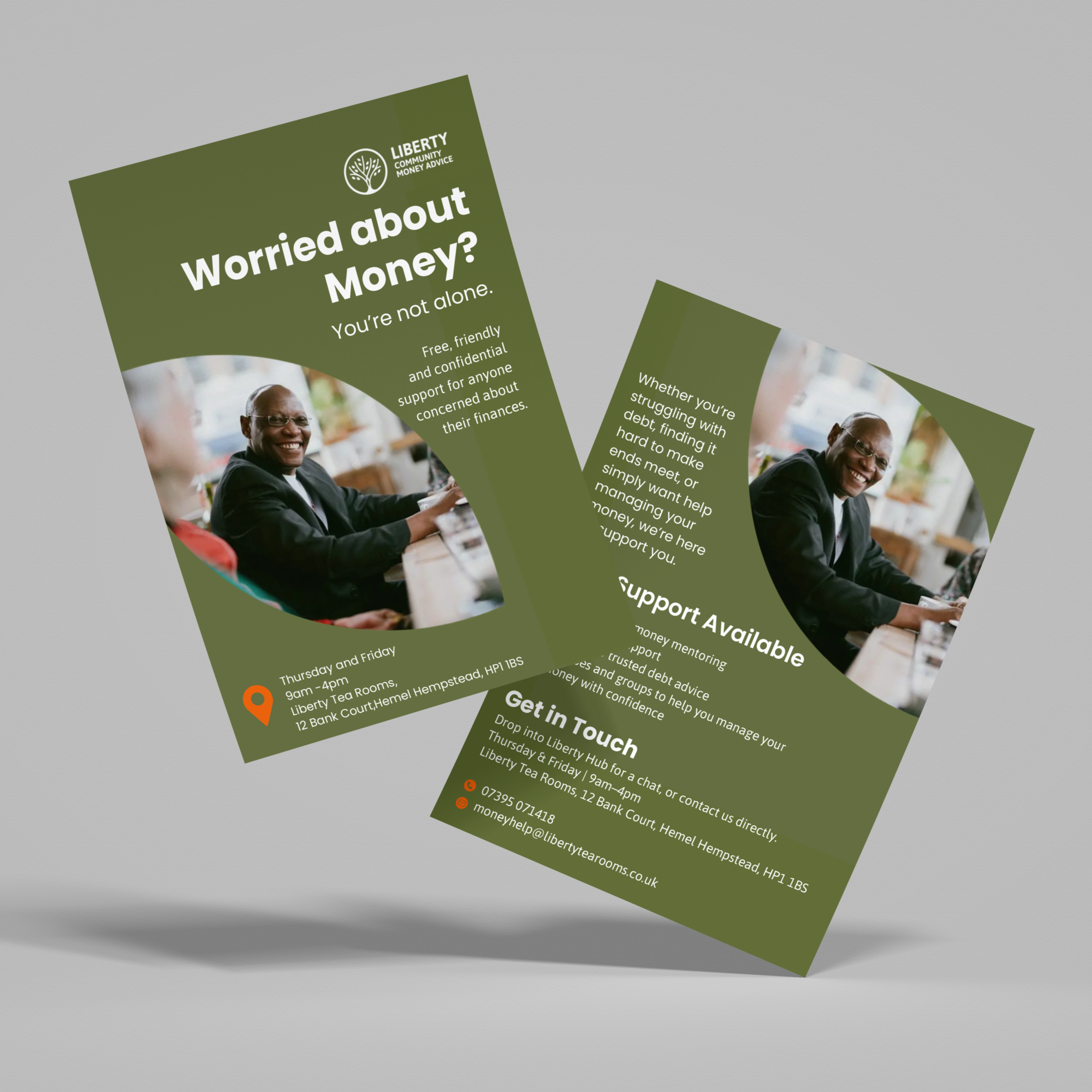
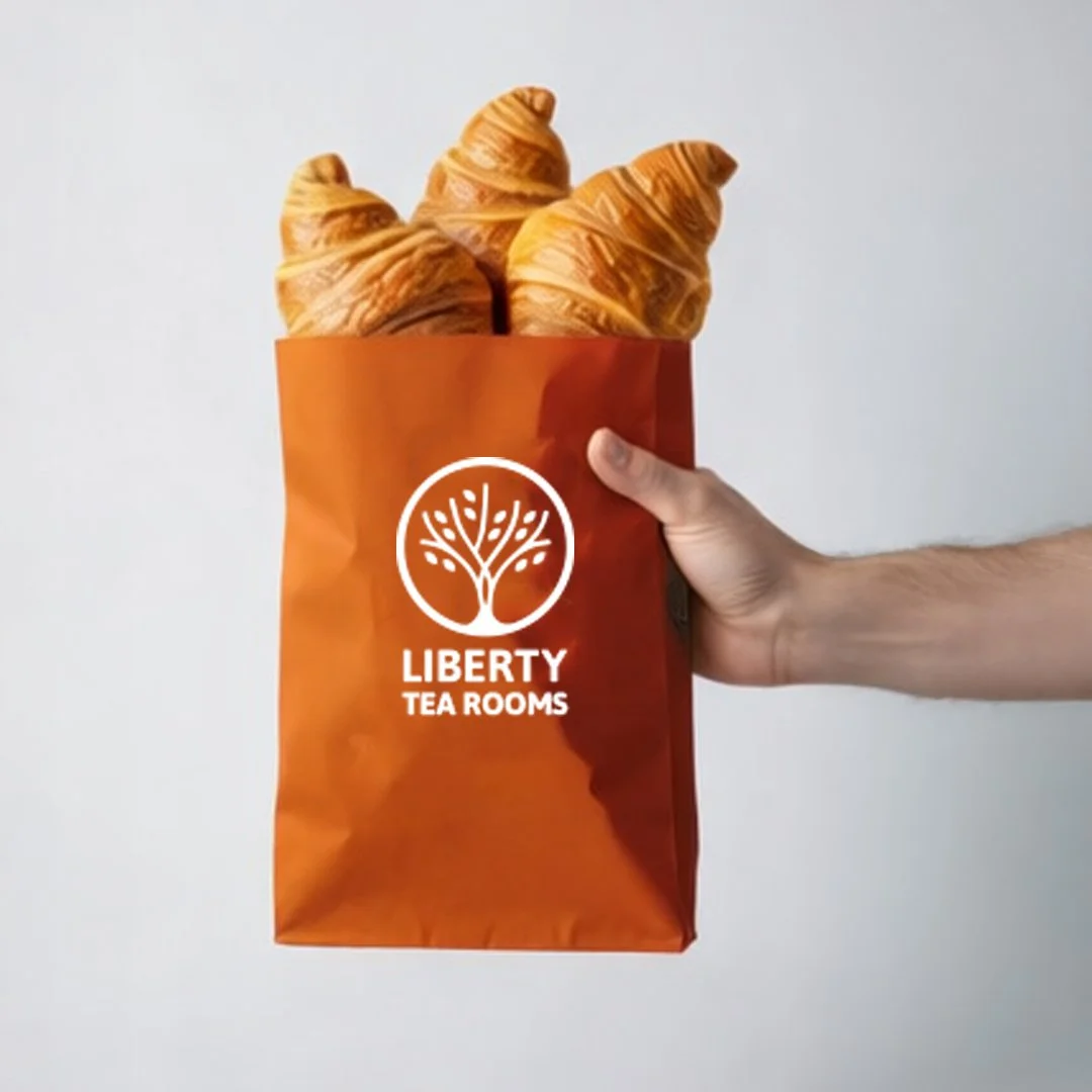
Over many years, Liberty Tea Rooms and Community Hub had grown into a thriving organisation serving its local community through a range of initiatives including Liberty Tea Rooms, Community Money Advice, Living Well and Life & Faith.
Each service was making a real difference, but as the organisation evolved, communicating the bigger picture became increasingly difficult.
People often knew one part of Liberty Tea Rooms, but they didn't always realise there was a wider organisation behind it. Staff and volunteers understood the heart of Liberty Hub, but explaining it simply and consistently was becoming a challenge.
Like many growing charities, Liberty Hub had reached a point where their organisation had evolved faster than their brand.
Before creating anything visual, we needed to answer a much more important question.
Who is Liberty Hub today?

Discovery Before Design
At Sodium & Co, we believe the strongest brands aren't invented, they're uncovered.
Rather than starting with colours and logos, we started by listening.
Through a series of discovery workshops with the leadership team, we explored Liberty Hub's history, culture, values, services, audiences and future ambitions.
Together, we asked questions that many organisations rarely have time to stop and answer.
What makes Liberty Hub different?
Why do people trust you?
What do you want people to feel when they encounter your organisation?
What story are all of your services telling together?
These conversations uncovered something important.
Liberty Hub wasn't simply a collection of projects.
It was one organisation with one purpose, expressed through different services.
That insight became the foundation for everything that followed.
Creating Clarity
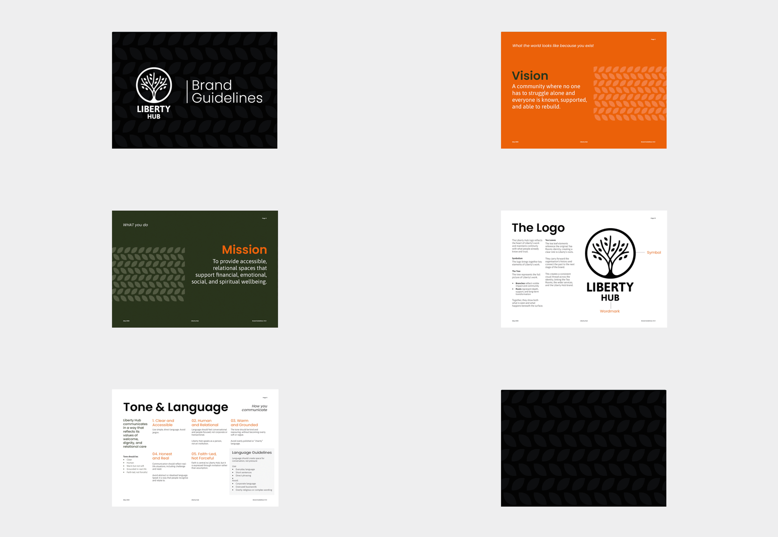
Once we had established the strategic foundations, we developed a clear organisational identity that united every part of Liberty Hub under one brand.
Together we created:
A refreshed organisational positioning
Vision, Mission and Purpose
Brand messaging
Tone of voice
Brand principles
Theory of Change
Brand architecture
Identity Blueprint
For the first time, Liberty Hub had a framework that clearly explained not only what each service did, but how every service contributed to one shared mission.
The Outcome
Today, Liberty Hub has more than a refreshed brand. It has clarity.
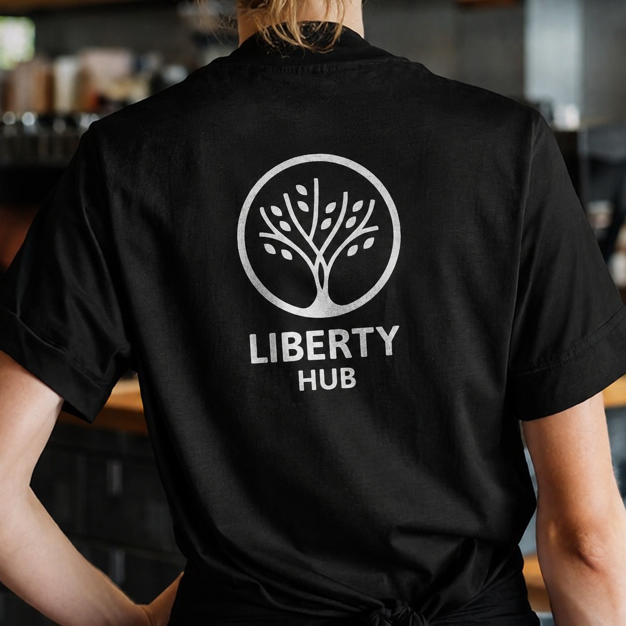
The leadership team now has a shared language for talking about the organisation. Staff and volunteers have practical tools that help them communicate consistently, while partners and funders can more easily understand the breadth of Liberty Hub's work.
As a result, Liberty Hub now has:
A clear organisational identity
Consistent messaging across services
Stronger recognition among partners and funders
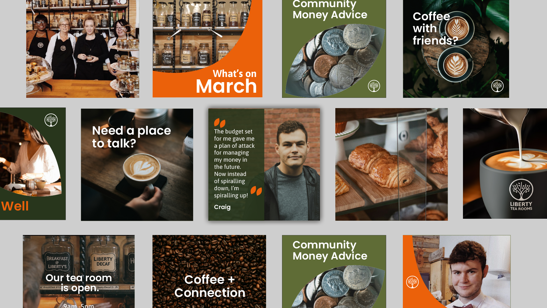
A visual identity system that supports future growth
A shared language for staff and volunteers
Most importantly, the organisation now has a brand that reflects who it has become and provides a strong foundation for the future.
Services Delivered
Visual Identity
Visual Identity
Brand Collateral
Brand Collateral
Charity Brand Strategy
Charity Brand Strategy
Discovery Workshops
Discovery Workshops

Looking for More Than a Rebrand?
Many charities don't need a new logo.
They need clarity.
If your organisation has grown, your messaging feels inconsistent, or you're finding it difficult to communicate your impact, we'd love to help.
At Sodium & Co, we help charities, churches and purpose-driven organisations uncover the heart of who they are, communicate it with confidence, and build brands that support long-term growth.
Because when your organisation is clear about who it is, everyone else can be too.